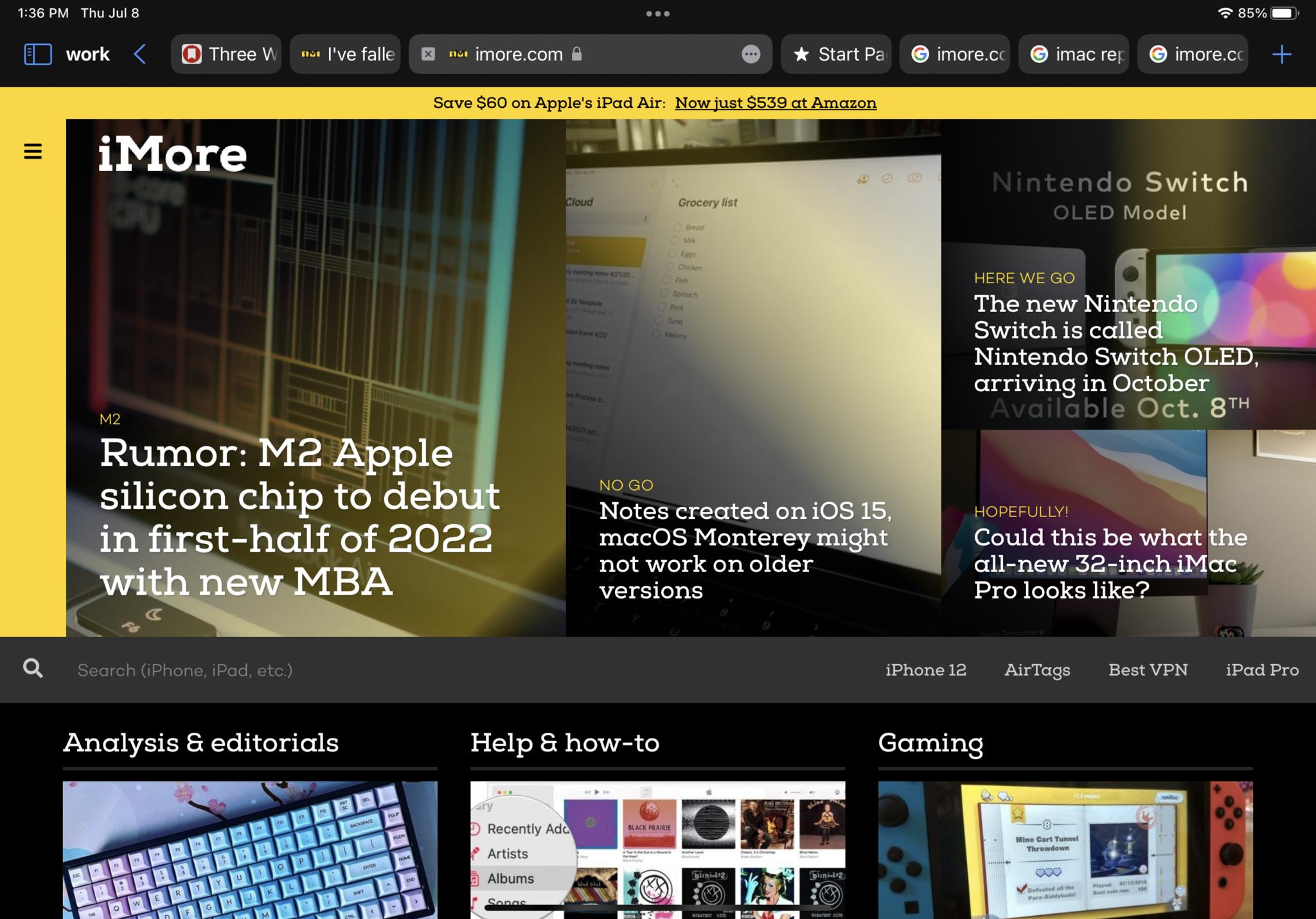
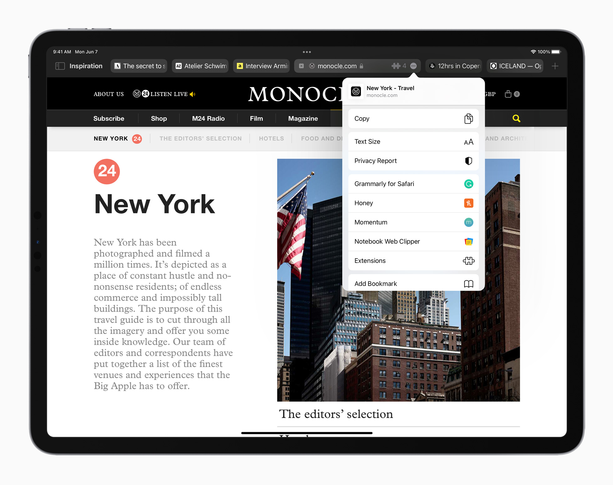
The design of Apple's Safari web browser in iOS 15, iPadOS 15, and macOS Monterey were supposed to be a triumph of redesign, yet the new update is causing lots of people lots of issues, and not everyone is sold on the new design. In our poll this week, we want to know what you think of the new design, even if you haven't yet used it yourself!
By way of background, Apple redesigned Safari across its software range, as announced at WWDC. For iPhone:
Safari gets a new design that makes controls easier to reach with one hand and puts content front and center. The new tab bar is compact and lightweight, and floats at the bottom of the screen, so users can easily swipe between tabs. Tab Groups allow users to save tabs and easily access them at any time across iPhone, iPad, or Mac. New features, such as the customizable start page and web extensions on iOS, make Safari even more personal and powerful.
Similar redesigns were in order for iPad, with a new tab bar that lets users see more of the web page that they're browsing:
Yet many of these changes have been met with hostile user responses. It seems that plenty of people on iPhone are struggling because the new floating tab bar at the bottom of the screen gets in the way of literally everything. On iPad, the new design has been amended to an opt-in model and Apple has also redesigned the macOS version, which previously meant your URL bar moved each time you selected a different tab.
So what do you make of these new designs? Do you prefer the new designs? Or are you more comfortable now Apple has made some tweaks? Perhaps you'd rather Apple hadn't touched them at all, let us know in the poll below. On mobile? Click here to view this week's poll.


0 comments:
Post a Comment