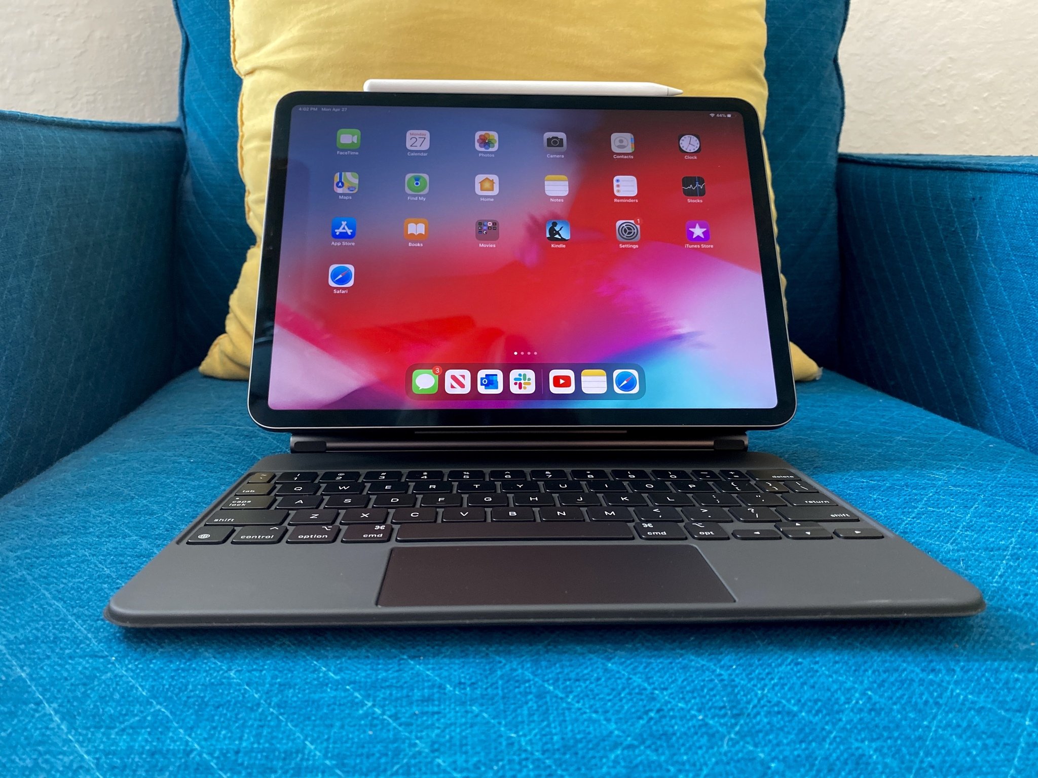
iPadOS 15 drastically improves the experience for power users without reinventing the wheel for everyone else.
After the summer beta period, iPadOS 15 is now available for the general public to download and install. After what was a light year in terms of iPad-specific features as Apple focused on refinement in iPadOS 14, many had hoped iPadOS 15 would bring along some game-changing new ideas.
While there's plenty to get excited about, especially for power users, iPadOS 15 is yet another update that looks to improve the foundational experiences in iPadOS. Let's dive in.
iPadOS 15
Bottom line: iPadOS 15 brings a sprinkling of new power user features while mainly focusing on improving foundational iPadOS features like the Home screen, Multitasking, and keyboard shortcuts.
Compatibility: Does your iPad run iPadOS 14? Then, it'll run iPadOS 15. The new software maintains compatibility with almost every iPad released since 2014, though not every iPad will get every feature.
Highlights:
- Movable Home screen widgets and App Library
- New Multitasking UI and Shelf
- Quick Note
- Overhauled keyboard shortcuts UI
- Fleshed out Do Not Disturb with Focus
- Refinements throughout iPadOS
iPadOS 15: Availability
Before you figure out whether you should install iPadOS 15, you need to know whether you actually can install it.
Thankfully, you most likely can since iPadOS 15 compatibility extends to any device that could run iPadOS 14, and iPadOS 14 already allowed any device that ran iPadOS 13 to upgrade.
That means you can run iPadOS 15 on almost every model released since 2014, the only exception being the iPad mini 3. That earns it top marks for backward compatibility, though some features won't work everywhere.
Just so you're sure, these are the devices that are compatible with iPadOS 15:
- iPad Pro 12.9-inch (5th generation)
- iPad Pro 11-inch (3rd generation)
- iPad Pro 12.9-inch (4th generation)
- iPad Pro 11-inch (2nd generation)
- iPad Pro 12.9-inch (3rd generation)
- iPad Pro 11-inch (1st generation)
- iPad Pro 12.9-inch (2nd generation)
- iPad Pro 12.9-inch (1st generation)
- iPad Pro 10.5-inch
- iPad Pro 9.7-inch
- iPad (9th generation)
- iPad (8th generation)
- iPad (7th generation)
- iPad (6th generation)
- iPad (5th generation)
- iPad mini (6th generation)
- iPad mini (5th generation)
- iPad mini 4
- iPad Air (4th generation)
- iPad Air (3rd generation)
- iPad Air 2
iPadOS 15: What's new
In the past, the iPhone would push the boundaries of where Apple wanted to go with its mobile OSes with iPad playing catch-up each year.
Since iPadOS was split out into its own OS (in name, more than anything else), it has had some special attention paid to it, but the name change hasn't really revolutionized iPadOS development. iPadOS 15 is a great example of how the iPad software plays second fiddle to its iPhone counterpart while still gaining some unique, iPad-specific features.
This year, Apple has continued to refine the iPad experience while adding new features power users are going to love. An overhauled Multitasking design should make it more accessible to all iPad owners, and features like movable Home screen widgets and the App Library will appeal to many. The iPad-first crowd will also be impressed by Quick Note, improvements to keyboard shortcuts, Focus, and more.
iPadOS 15: First things to do
Already running iPadOS 15 and wondering where to start? The best place to start is on your Home screen. Since you can now move widgets anywhere on the screen, and you have easy access to the App Library, you can customise your Home screen to display only the apps and information you want while hiding away any mess.
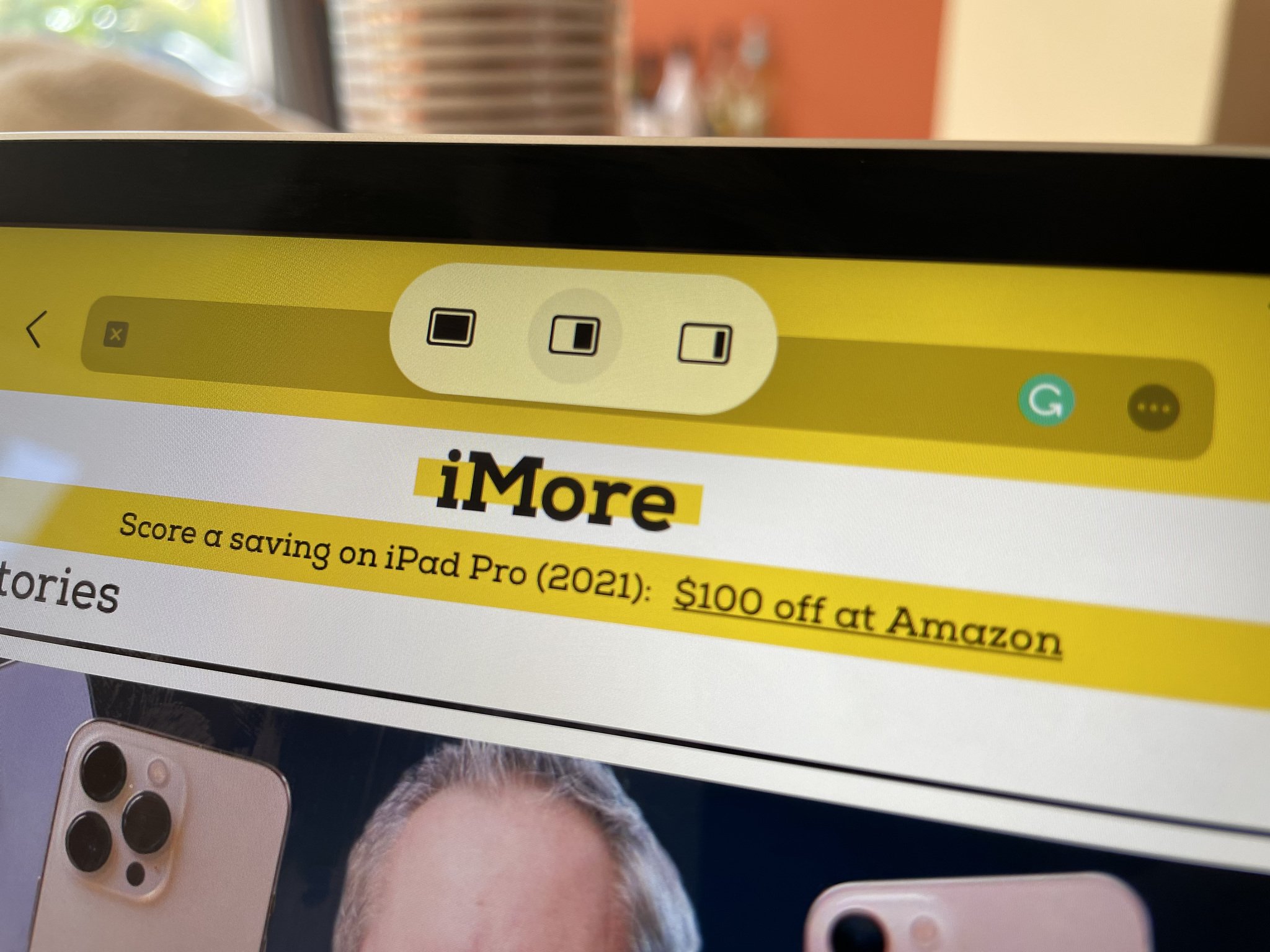
I'd also recommend getting to grips with the new iPad Multitasking UI. You'll see the new ellipsis icon at the top of the screen when you have an app open. Tapping it allows you to invoke different Multitasking layouts without needing to learn any hidden gestures. This, plus Quick Note, could unlock some interesting news ways of working on your device.
It's also worth checking out our iOS 15 review. There's a lot of crossover between the two OSes, and this review focuses mainly on the iPad-specific aspects, so there may be more to glean from the phone counterpart.
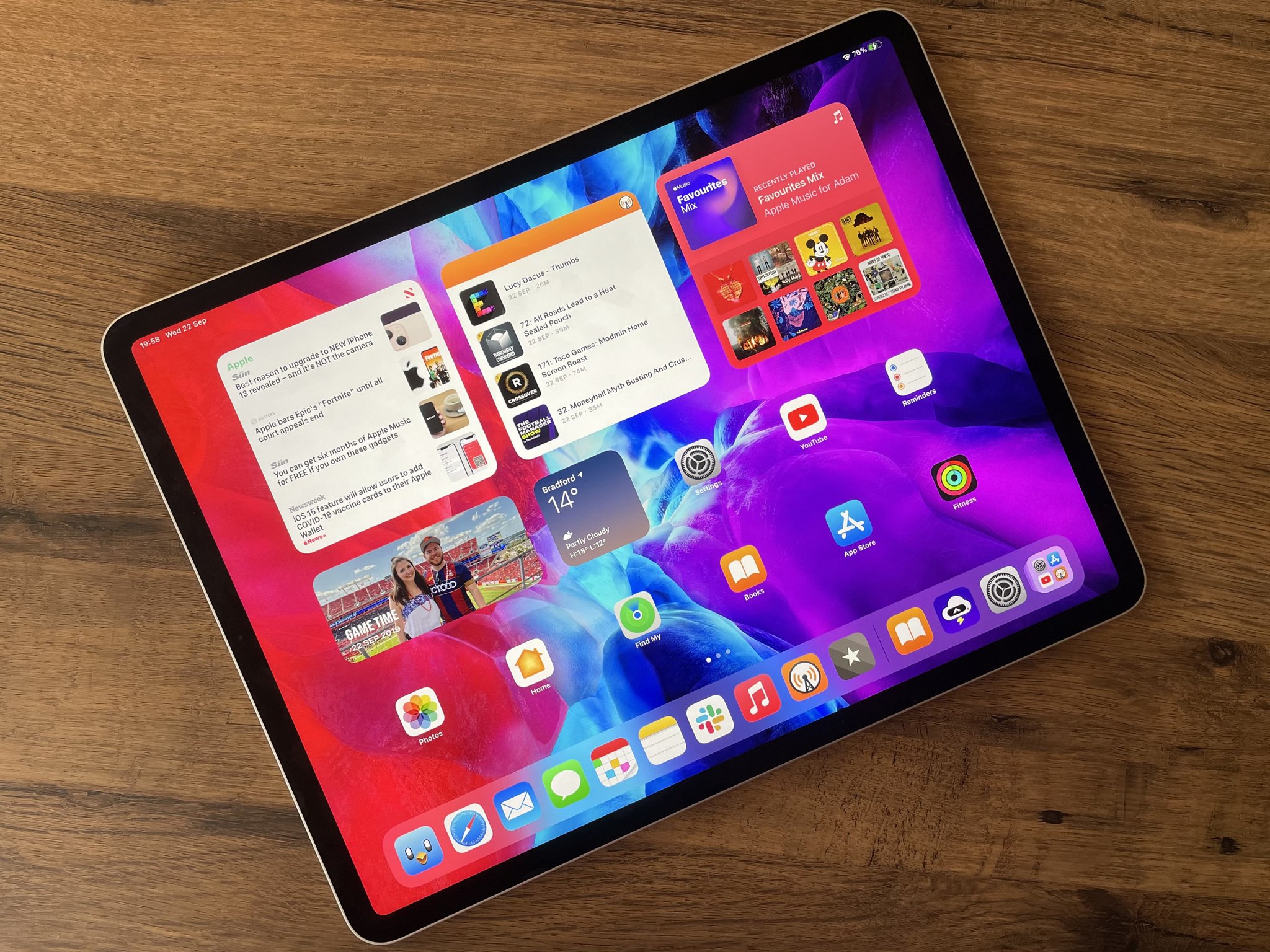
iPadOS 15: Widgets and App Library
In a way, one of iPadOS 15's major new features is simply righting a wrong that occurred with iPadOS 14. Last year, it seemed a baffling decision to ship iPadOS with widgets but without the ability to place them anywhere on your iPad Home screen and without App Library at all.
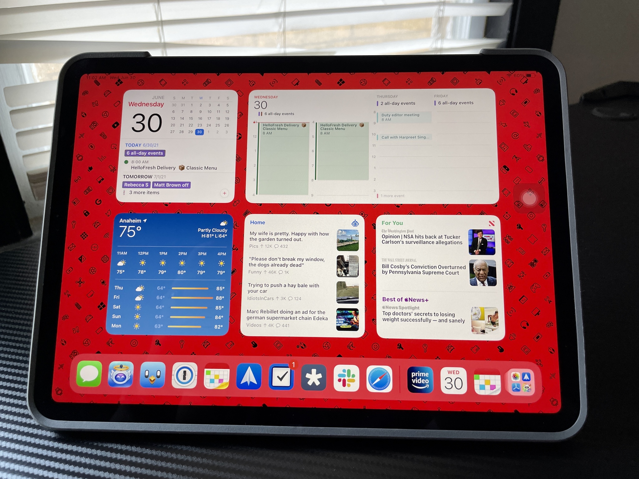
Perhaps Apple ran out of time to get these features ready for launch or maybe the company really believed iPad users would want or need them. Regardless, these issues have been resolved this time around. Now, Home screen widgets have been freed from the confines of the "Today" view side panel on your first Home screen and can now be moved around and placed anywhere you want.
If you're a fan of the Today view, it's still there — you just have to swipe right to bring it into view because it's now hidden by default instead of being persistent on the Home screen. Whether this is a good or bad change is dependent on how much you liked the Today view in the first place.
Today view-only widgets and the lack of an App Library were baffling iPadOS decisions last year.
I much prefer being able to place widgets in more of a free-form manner rather than being restricted to one side of the screen and I generally keep my most-used apps in the Dock anyway — and in iPadOS 15 you can keep up to 17 apps there, up from 15. The only real downside for me is the large date and time not being always visible (it is still visible in the status bar, though, just smaller).
Like on iOS, Home screen widgets are still a bit of a nightmare to arrange in iPadOS 15, and you'll find yourself chasing around random app icons and losing things to the next screen. It is easier to edit existing widget stacks, however, and once you have things set up the way you want it's a pleasant experience having glanceable information available. Apple even lets you have two different layouts for your widgets — one for landscape and one for portrait orientation — so that you don't see a jumbled mess when you go from one mode to the other.
There's a new size-class of widget specifically for iPad in iPadOS 15: XL. This effectively takes up the space of eight app icons on the screen, though it only works with a handful of apps right now. It does, however, offer a pseudo-desktop experience when used with the Files app which is a unique use for it.
If you want to go the whole hog and remove all app icons from your Home screen, you can do that with iPadOS 15 thanks to the App Library. With App Library, I can not only remove app icons from my Home screen without deleting the app itself, but the Library is always a swipe away, and it's even in the Dock itself. You can easily bring it up by swiping left from your last Home screen page or bringing up the Dock. When you combine the App Library with Spotlight, which can also be accessed from pretty much anywhere, there is little reason to keep app icons and folders cluttered all over the Home screen if you don't need to.
iPadOS 15: Multitasking and Shelf
Apple has done a lot for Multitasking in iPadOS 15, perhaps the biggest overhaul since iPad split-screen apps debuted in iOS 9. The updates make Multitasking much easier to discover and use which is a boon to both the average iPad user and power users.
Previously, Split View and Slide Over on the iPad were only accessible via hidden drag-and-drop gestures — if you were not someone who dug into the ins and outs of how to use an iPad, then you may have missed it completely. Think of a less tech-savvy family member that has an iPad, for example; do you think they know how to use Split View and Slide Over without any help?
Another limitation of having iPad multitasking being locked away behind multitouch gestures is that you don't have any flexibility if you're using an external keyboard or keyboard case because there was also no support for keyboard shortcuts. iPadOS 15 changes both of these shortcomings.
If you were not someone who dug into the ins and outs of how to use an iPad, then you may have missed split-screen Multitasking completely.
Now, in iPadOS 15, you have an all-new Multitasking menu which you can access from any active app thanks to the ellipsis (•••) indicator at the top of the screen. Tapping it brings up a menu with Multitasking layout options including Full Screen, Split View, and Slide Over. Some apps, such as Mail and Notes, also support a fourth option — Center Window — wherein you can open a specific email or note in the middle of the screen. Other apps may adopt this over time.
In addition to controlling the layout, the ellipsis indicator shows you your currently active app with a darker grey shading for the app in use. This is slightly easier to see than the previous pill-shape indicator and should reduce the number of times you type into the wrong app. It also serves as a grab handle to drag-and-drop windows and rearrange your Multitasking layout.
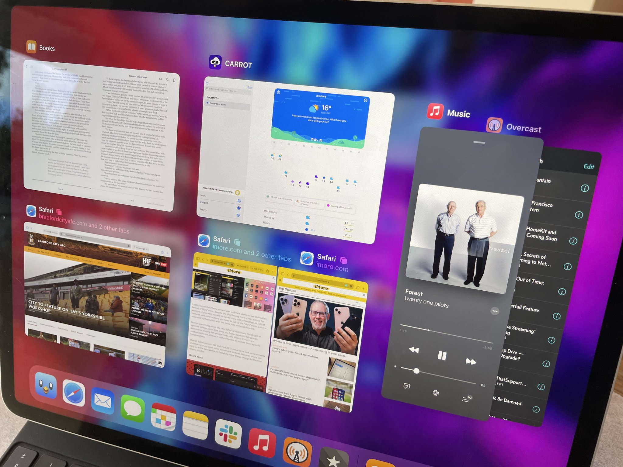
In the App Switcher view, it's now easier to drag-and-drop apps onto one another to form split views and labels make it easy to see what app is paired with what. Slide Over windows now show in the App Switcher UI, too, again surfacing different ways to use apps together while simultaneously making things easier.
As I've written before, even as a heavy iPad user who often works from the device, I found the previous iteration of Multitasking to be a confusing mess. I never really got on board with the gesture-based interface so essentially worked with one app at a time most of the time. If a self-confessed nerd like me struggled with Multitasking before, I suspect I am not the only one that will appreciate the changes here.
On top of an improved Multitasking UI, iPadOS 15 has brought a new 'Shelf' view in supported apps. It's essentially a window picker that appears at the bottom of an app when you open it and displays a tray with all available open windows for that specific app. Windows in the Shelf will differ in size based on what Multitasking mode they are in and the shelf auto-minimizes as you interact with the app.
This feature is a little hidden away, but it's easy enough to use once you get into the habit and it makes it really straightforward to open up a Split View instance with drag-and-drop. If you need to prompt the Shelf to appear after it has minimized, you can do so with the keyboard shortcut Globe-Down or by long-pressing the app icon and selecting "Show All Windows".
Depending on your workflow, you might never utilize the Shelf but I have found it really handy in Notes where I can quickly reference notes from various folders without having to tap through layers of menus.
iPadOS 15: Keyboard shortcuts
The updates to keyboard shortcuts could have fallen into the Multitasking section of this review, but the changes are so significant I feel they needs a section of their own.
While iPadOS 14 supported keyboard shortcuts, the feature is much more robust in iPadOS 15. The first thing you'll notice when it comes to keyboard shortcuts is a redesigned menu when you hold down the ⌘ key.
The menu is now much more reminiscent of a Mac's menu bar, which no doubt helps with Catalyst apps, with commands listed under categories like File, Edit, View, and more which makes it much easier to find the shortcut you were thinking of but couldn't quite recall. Start typing in this view and you'll also be able to search for a particular shortcut if you can half-remember what it's called.
On top of keyboard shortcuts using the ⌘ modifier, Apple has also repurposed the Globe key with iPadOS 15, giving you easy access to system-wide controls without needing to take your hands off the keyboard. If you're a keyboard-first user, any opportunity to keep your hands on the keys is a boon for productivity.
Holding the Globe key brings up a similar shortcut menu pop-over with the search functionality. You'll find quick actions here for things like returning to the Home screen, switching apps, Multitasking, showing the App Library, invoking Siri, and much more. Some third-party iPad keyboards have dedicated keys for these functions which I felt Apple's Magic Keyboard lacked when it launched, but it's now possible to pick up a few keyboard shortcuts for the actions you use regularly.
On top of the shortcuts, Apple has now built in keyboard navigation for the iPad UI itself. That means you can use the arrows key to shuffle around the Home screen, App Library, or within apps like Settings, and hit Return to make a selection. On the Home screen, a tvOS-like highlight shows around the icon or widget you are currently 'hovering' over, though I found this to be very hard to see with my wallpaper. Your mileage may vary on that front, though it's another way for users to keep their hands on the keys more of the time
iPadOS 15: Quick Note
Perhaps my favorite new feature in iPadOS this year is Quick Note. When I first saw the feature shown off during the WWDC keynote, I greatly under-estimated it and thought of it as something of a gimmick but I am happy to have been proven wrong.
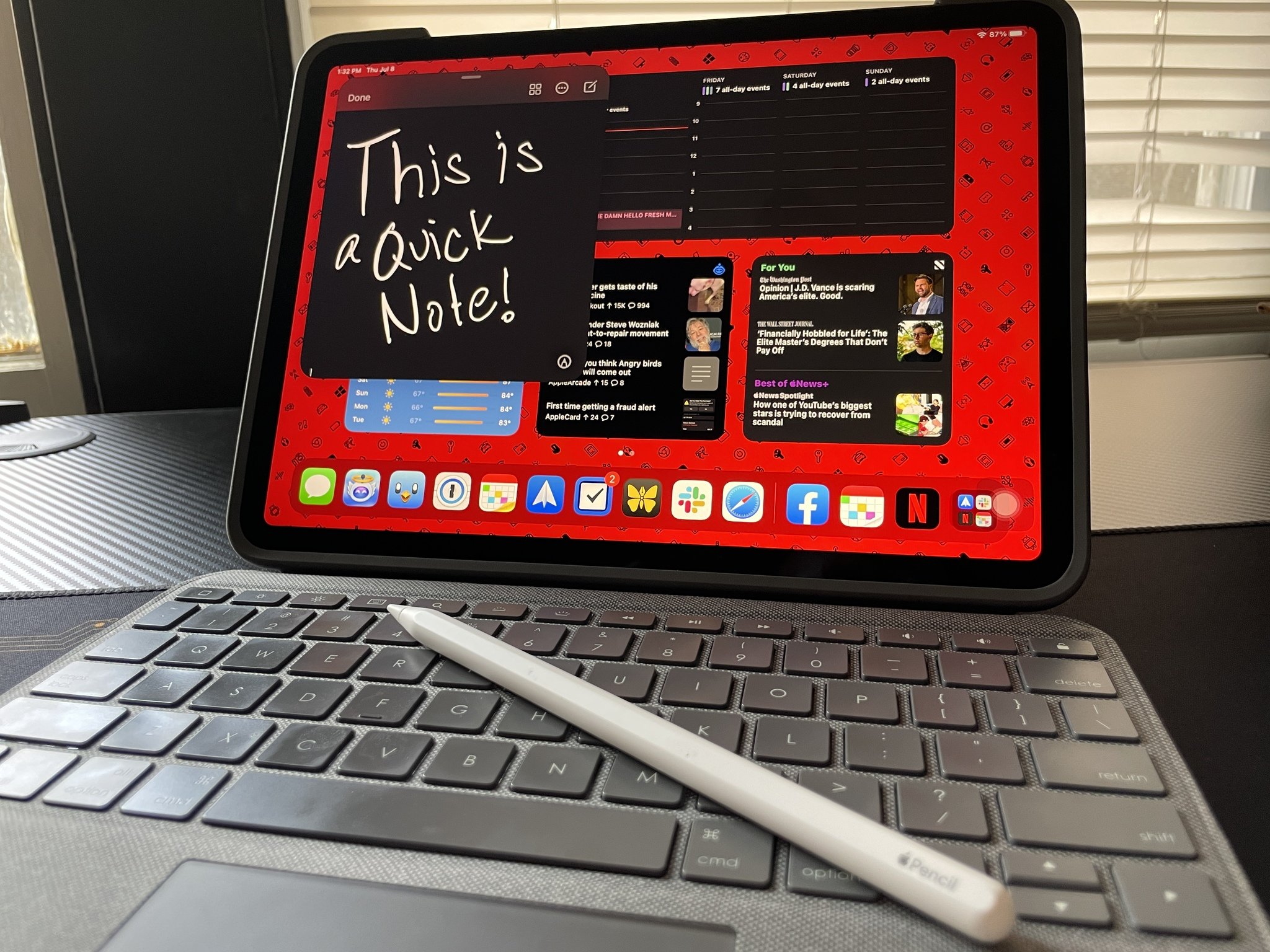
Quick Note is a new universal capture system that you can invoke at any time by swiping from the bottom right corner of your iPad screen with your finger or Apple Pencil (or alternative stylus). You can also get to Quick Notes by pressing Globe-Q on your keyboard, hitting the Quick Note toggle in Control Center, or by tapping "New Quick Note" from the contextual menu when selecting text in Safari.
Doing so brings up what is essentially a picture-in-picture window which acts like a scratchpad for jotting down, well, a quick note. You can type in your Quick Notes, handwrite with Apple Pencil, drop in links, images, and more. You can even have more than one Quick Note, choose which shows up first, and swipe between them in the Quick Note window. During my testing of iPadOS 15 leading up to this review, I used Quick Note extensively as it was super convenient to have a place to note things down as I came across them.
The main downside to Quick Note is that it is exclusive to the Notes app, meaning you can't set your favorite third-party note-taking app to work in the same way. I'm a heavy Notes user, using it for most of my research for stories at iMore as well as jotting things down in my personal life, so I don't mind this limitation, but it does make the feature less useful for those outside of Apple's system for notes.
iPadOS 15: Focus
While not exclusive to the iPad, I feel Focus warrants some attention for its usefulness to iPad users. As iPads, particularly the best iPad models, become more powerful and continue to replace traditional laptop computers for more people and more tasks, it's important that the software keeps up with those demands. By that I don't just mean powerful productivity apps like Photoshop or Ulysses or Ferrite being available on the iPadOS platform, but iPadOS itself creating an environment that lends itself to getting work done.
A lot of the updates in iPadOS 15 suit power users, from Multitasking revamp to the keyboard shortcuts overhaul, which make it much easier and more efficient to work from an iPad. Focus in turn makes it much easier to remain, well, focused on the task at hand.
The best way to describe Focus is a beefier version of Do Not Disturb. With Focus, you can set up customized Do Not Disturb modes for things like Work, Personal, Entertainment, Gaming, Sleep, Driving, and anything else you may need. While a Focus is active, you can select which people and apps can reach you with notifications, and you can even choose to receive only time-sensitive notifications that may be more urgent than low-priority alerts.
The beauty of Focus is you can create different modes for different use cases and totally redesign your own iPad experience to suit.
Focus is also ideal for muting distractions while working, when handing an iPad off to a child to play games, reading, watching a movie, and all manner of other use cases. The beauty of Focus is you can create different modes for different use cases and totally redesign your own iPad experience to suit.
Better yet, you can select specific Home screens that show or become hidden automatically depending on which Focus mode is active. That means you can set up a Work focus that only displays your Calendar widget, Mail app, work chat app and other productivity tools and takes away the temptation of distracting apps like Twitter and Facebook. Turn on your Gaming Focus and have all of your Apple Arcade titles presented front-and-center, or your Entertainment Focus switch over to a Home screen with the Apple TV widget, Netflix app, and more.
All Focus modes can be turned on manually from the Control Center, but you can also enable Shortcut Automations for them to turn on once certain criteria (launch a certain app, arrive at a certain location, at certain times of the day, etc.) are met, or even use on-device intelligence to turn it on at opportune times (once it learns your habits). All of this makes for a context-aware, smart device that adjusts to your needs.
iPadOS 15: Safari
While Apple has made great strides, on the whole, to refine the user experience across iPadOS with version 15, Safari is an odd outlier. While the controversy has been much stronger around Safari in iOS 15, just because Safari is less bad on iPadOS 15 doesn't mean it should escape criticism.
Firstly, a redesigned tab bar now comes in two different flavors: Separate or Compact, neither of which are an improvement on what came before. With Compact selected, it's hard to distinguish tabs from one another because the address/search bar is now unified with your tabs, which is hard to distinguish from each other, especially if you have several tabs open. As you select a tab to be the current view, it expands in order to fill up the horizontal space of the address bar, but as a result, the other tabs get smaller.
This results in the tabs jumping and moving around a lot, and it's harder to see what you have in tabs since you can't get a preview of it unless you hover over it with a trackpad, making this especially problematic if you don't use a keyboard with a trackpad or something similar. The tabs are also harder to tap and click on with more tabs open, and the size of the tabs is also further reduced if you are using Split Screen mode.
And while Safari on iPadOS 15 still has a refresh button, you cannot see it unless you hover over the address bar. You can pull-to-refresh, but this only works if you are already at the top of the page. Switching to Separate alleviates the reload problem as the address bar for the active tab remains at the top of the screen with its dedicated refresh button, though the same issue of unreadable tabs occurs once you have enough of them open.
While Apple has made great strides to refine the user experience across iPadOS 15, Safari is an odd outlier.
Regardless of the tab bar design you choose, you'll also see your Favorites displayed beneath the tabs. This makes zero sense with how other browsers, and Safari in the past, handled this with tabs always being the lowest portion of the tab bar. This made sense as the tab indicated the page you were currently viewing. With Favorites breaking up the tab bar in this way, it's even less usable in my opinion.
It isn't all bad with Safari in iPadOS 15. The new sidebar is an improvement on the old one with easier access to Reading List and Bookmarks, as well as tabs and tab groups. The latter, tab groups, is probably the best update to Safari this year.
The feature keeps a group of tabs in what is effectively a bookmark folder that you can name and sync across your devices. However, each is a tab and not a static link to the same URL, so it's more about keeping your device free from an unwieldy list of dozens of open tabs. Have a bunch of tabs open while researching a particular topic? Create a tab group from them and you can store them out of the way of your day-to-day browsing and still have easy access to them when you need to. You can have several tab groups, switch between them, and change their contents easily.
iPadOS 15: Refinement
There so many more iPad-specific updates and little details on top of the features described above that it would be impractical, if not impossible, to go through them all here. The overall focus from Apple seems to have been on further refining the iPadOS experience without ripping up the rulebook with any fundamental changes.
App designs have been made cleaner and more modern, there's a new floating keyboard shortcut bar that can minimize into a button, Low Power mode is available on the iPad for the first time, and notifications are easier to read and manage from the Lock screen.
Little things like the date and time picker reverting back to the scrollable wheel when touch input is being used are a nod to Apple being able to admit when it got something wrong (there's hope for Safari yet!) and new guidance screens when erasing a device or moving to a new one will make it easier for regular folks to understand what they are doing. Apple has polished a lot of rough edges with iPadOS 15 in ways you might not notice but will definitely feel.
iPadOS 15: More to come
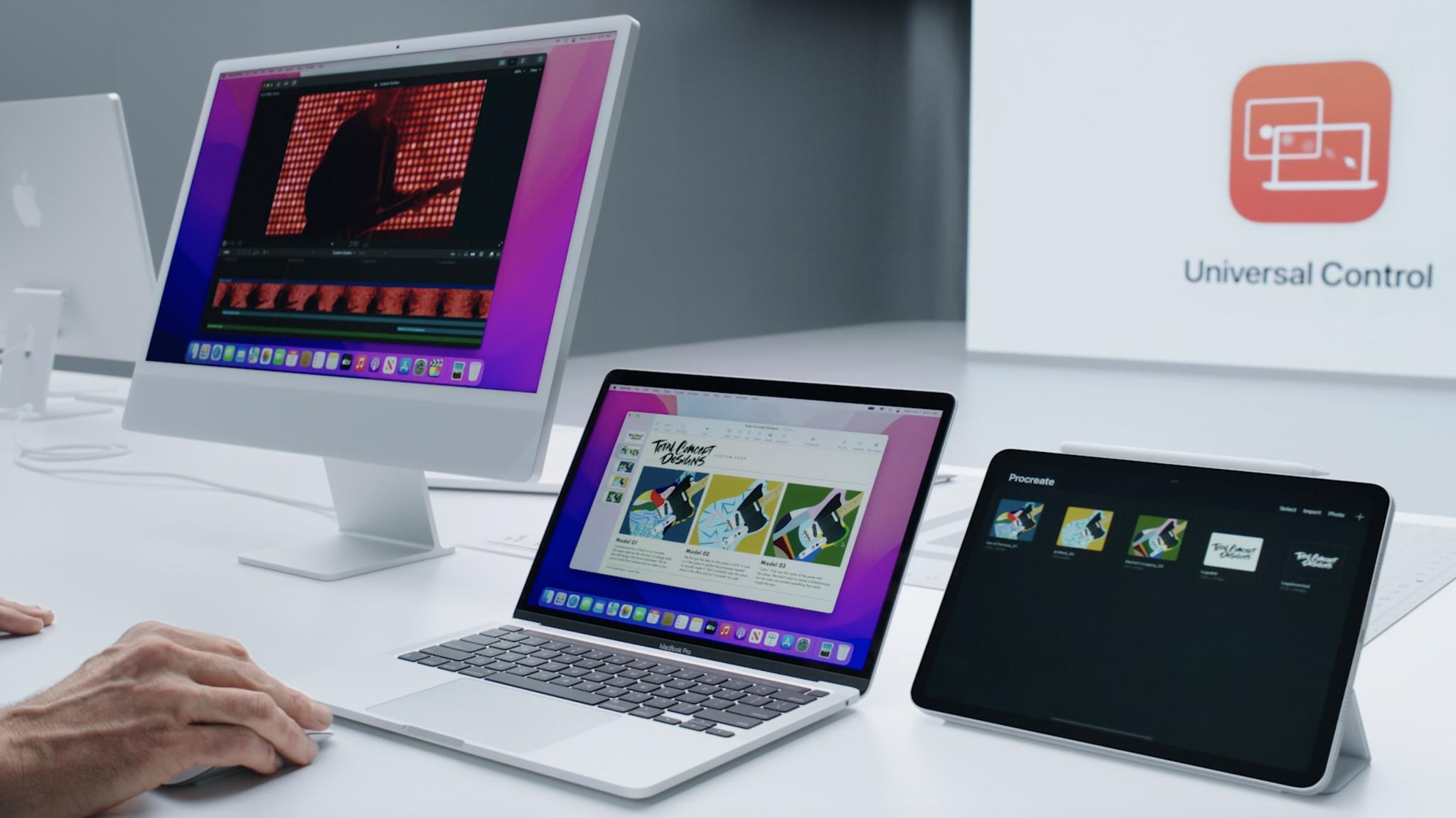
That being said, there are a few key features absent from iPadOS 15 at launch, the most notable of which are SharePlay and Universal Control.
Both require cross-platform compatibility and stability, so it's no real surprise that these are hard to nail down, but they are some of iPadOS 15's tentpole features so it's disappointing that they have been pushed back. Hopefully when they launch they will be rock-solid and worth the wait.
iPadOS 15: Should you wait?
In short, no. If your device supports iPadOS 15, and it probably does, then you should update as soon as you can. The year-over-year improvements are worth updating for, even if Safari is a bit of a step in the wrong direction.
iPadOS 15 might just unlock some extra functionality for you in your iPad that was there all along but you just didn't know about with easier-to-use Multitasking, plus new features like Quick Note and Focus make it a productivity dream.
iPadOS 15: The bottom line
While iPadOS 15 is light on standout new features, Apple has touched basically the entire OS with this update, adding a bit of shine and making a concerted effort to make things more usable for more people.
In every area (except for Safari), Apple has improved the iPad user experience making it a must-download. Further point-release updates to iPadOS 15 will bring along more features in time, too.
iPadOS 15
Bottom line: It's another year of refinement for iPadOS, but that's not necessarily a bad thing with the overall polish of iPadOS being top-notch. Outside of some rogue design changes to Safari, iPadOS 15 is better in basically every aspect than its predecessor.



0 comments:
Post a Comment